RILA Website Redesign
Transforming web presence from an Event Platform to Industry Authority

Role
UX Design Lead
Year
2024
Client
RILA
From small tweak to full transformation
Retail Industry Leaders Association (RILA) is a trade association representing retail leaders that advances the industry through public policy advocacy, operational excellence, innovation, and research-driven thought leadership focused on economic growth and sustainability.
Goal
Retail Industry Leaders Association (RILA) is a trade association representing retail leaders that advances the industry through public policy advocacy, operational excellence, innovation, and research-driven thought leadership focused on economic growth and sustainability.
The Outcome
A bold, dark-themed redesign with a flexible component system that repositioned RILA as a comprehensive industry resource, re-energized internal stakeholders, and provided the design flexibility needed to maintain brand consistency without creative constraints.
My Role
I joined the project shortly after stakeholder interviews were completed. Based on those insights, our team quickly realized that minor homepage tweaks wouldn’t meaningfully improve their presence as an event organizer or help achieve their broader goals. Instead of recommending a full redesign, I was asked to present two distinct directions.
The first was a conservative update that met the original request while working within existing constraints.
The second was a homepage proof of concept that tackled deeper issues - simplifying navigation, clarifying positioning, and making member value more visible, while introducing a stronger, more modern brand presence.
Discovery
Before going directly into design, I did a quick dive into RILA's feedback, marketing materials and brand to get a better understanding of their needs and the industry.
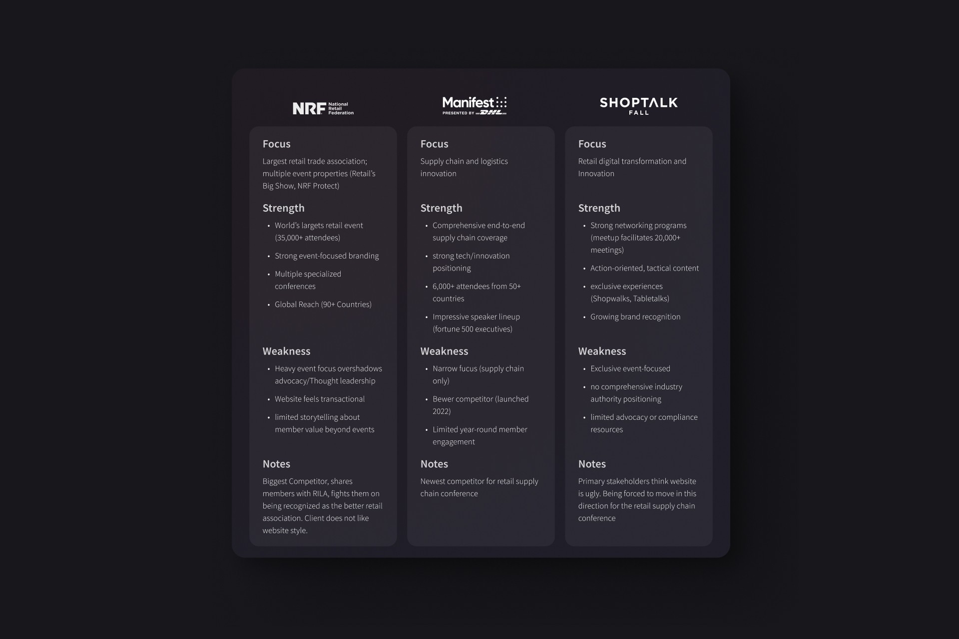
Competitive Analysis
I performed a small SWOT analysis to identify if RILA's competitors and peers were already positioning themselves as industry authorities. What I learned:
Their competitors focused primarily on event organization rather than thought leadership, member benefits or advocacy work
Most sites felt transactional, focused on registration and attendance rather than ongoing value delivery
Event-heavy navigation patterns created information overwhelm similar to RILA's original site
RILA could differentiate by positioning itself as more than an event host by showcasing its role in advocacy, compliance guidance, innovation leadership, and industry insights alongside its conference offerings. This would establish RILA as the go-to resource for retail leaders throughout the year, not just during events.
Design Solutions
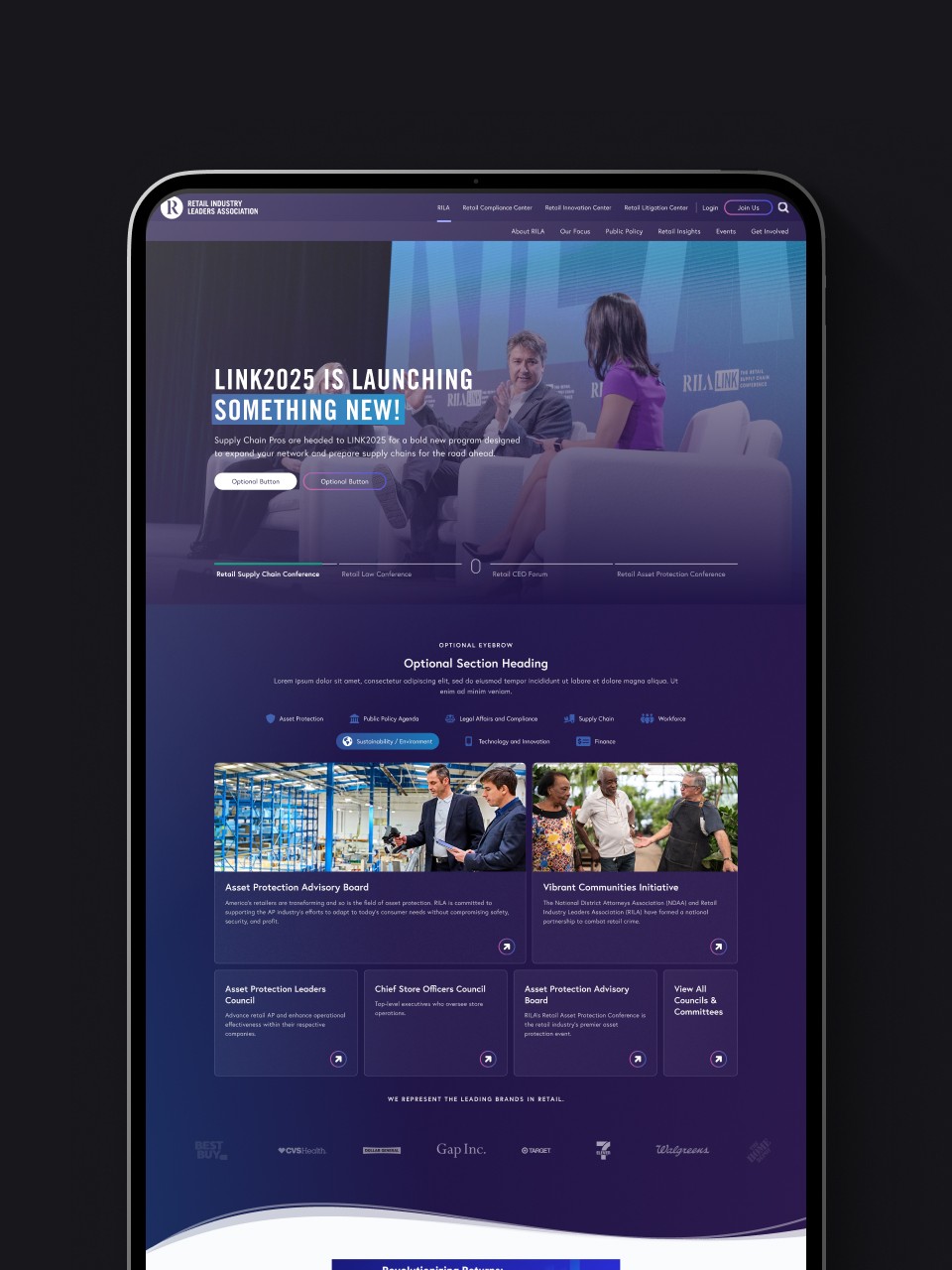
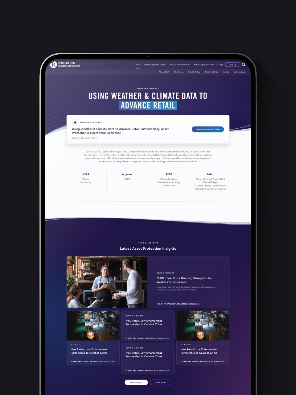
I took everything gathered from the limited discovery research and stakeholder feedback to create a quick modern, more interactive homepage concept to demonstrate the direction to the client.
This concept focused more on storytelling to communicate RILA's mission and services, and introduce interactive and animated elements to engage users more. It is a blend of visuals and direct access to essential content.
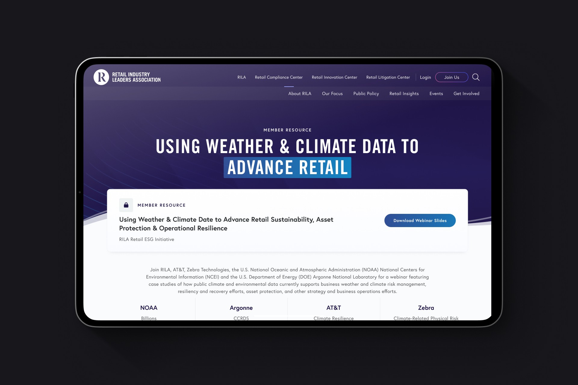
The dark theme wasn't purely aeshtetic, it solved multiple problems. RILA's vibrant brand colors were difficult to use on white background while maintaining WCAG accessibility standards. A dark foundation let us incorporate these colors in more ways than just accents.
Navigation Restructure
Collaborating with our VP of UX Strategy, we replaced the cluttered hamburger menu with a contextual navigation bar displaying main categories for each sub-brand. For RILA, these included About, Our Focus, Public Policy, Retail Insights, Events, and Get Involved. This made offerings easier to scan and clarified each sub-brand’s unique navigation.

Making member value visible
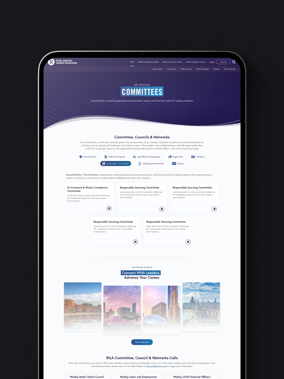
The original site hid member-only content completely behind authentication walls. Committee rosters, industry reports, and compliance resources were entirely invisible to prospective members, forcing them to purchase what was essentially a mystery box. I redesigned resource cards to include 2-3 sentence previews that communicated specific value without giving away full content. Clear lock icons set expectations and signaled premium value consistently across the site.
I also redesigned the committee pages to be more than a paragraph of text. These pages now helped users see the value of becoming a member by previewing networks, RILA Committee, Council & Network Calls and providing useful insights for members. This approach transformed authentication from an arbitrary barrier into a compelling call-to-action, building desire through strategic transparency rather than blocking a user's journey.
Flexible Component System
I redesigned existing components to make the transfer of content from the old site to the new structure 1:1. I expanded on these components by adding multiple variations such as media options, color options, layout options; and added new components to allow enough flexibilty that the stakeholder would not create off-brand hacks to the content. At the end of the design, I was able to present RILA with a robust component library with over 20 unique components including:
Conference Site Redesign: Unified System with Distinct Identities
A critical part of the redesign involved extending the new component system to RILA's conference microsites. Previously, these sites operated with limited flexibility and inconsistent branding. I created unique color themes for each conference drawn from RILA's secondary palette which allowing each event to maintain its own distinct identity while leveraging the full component library from the main site. This approach gave conference sites the same design flexibility and modern aesthetic as the primary RILA platform, eliminating the need for one-off custom components while ensuring brand consistency across the entire digital ecosystem. Each conference could now build compelling, on-brand pages using the same hero variations, feature blocks, event components, and content modules available to the main site, just with their own signature color treatment.


Impact & Reflection
The redesigned RILA is preparing to launch in early 2026, representing a complete transformation from our initial brief. Our primary stakeholder went frwebsite om thinking of us as order followers to excited partners, praising the design in company-wide channels. She was re-energized and excited to format content for the new platform, confident the component library would provide creative flexibility without forcing off-brand workarounds.
Conducting a full redesign without extensive discovery required relying on UX fundamentals, accessibility best practices, and proven patterns rather than custom solutions validated through testing. The stakeholder's deep member knowledge helped guide decisions, but this experience taught me to work confidently with constraints.