Addition Financial Website Redesign
Turning a dated platform into a modern, personalized member experience

Role
UX Design Lead
Year
2024
Client
Addition Financial
A banking experience that wasn't working
Addition Financial is a member-owned, not-for-profit credit union serving 26 counties across Florida with 27 branches. As a financial cooperative, they prioritize member value and community impact over profits.
The Problem
Addition Financial approached us for a website redesign and platform migration. Their existing site, built in 2018, had become a significant liability—suffering from slow performance, cluttered navigation requiring excessive clicks to find basic information, and a dated design that failed to represent their refreshed brand identity.
Member feedback revealed critical pain points: "buried information," navigation that felt like "buying a house just to make an appointment," and a site that "reminds me of Juno.com." The majority of members visited solely to access Online Banking, bypassing the site's content entirely—a missed opportunity for product discovery and engagement.
My Role
I teamed up with our VP of UX Strategy to tackle the UX design strategy for this project, handling information architecture restructuring, wireframing, and visual design across a 2-month timeline.
Goal
Modernize Addition Financial's digital platform to reflect their brand refresh while increasing conversions through streamlined user pathways, personalized experiences for Personal and Business banking audiences, and enhanced findability via restructured navigation that reduces friction to key content and services.
Discovery
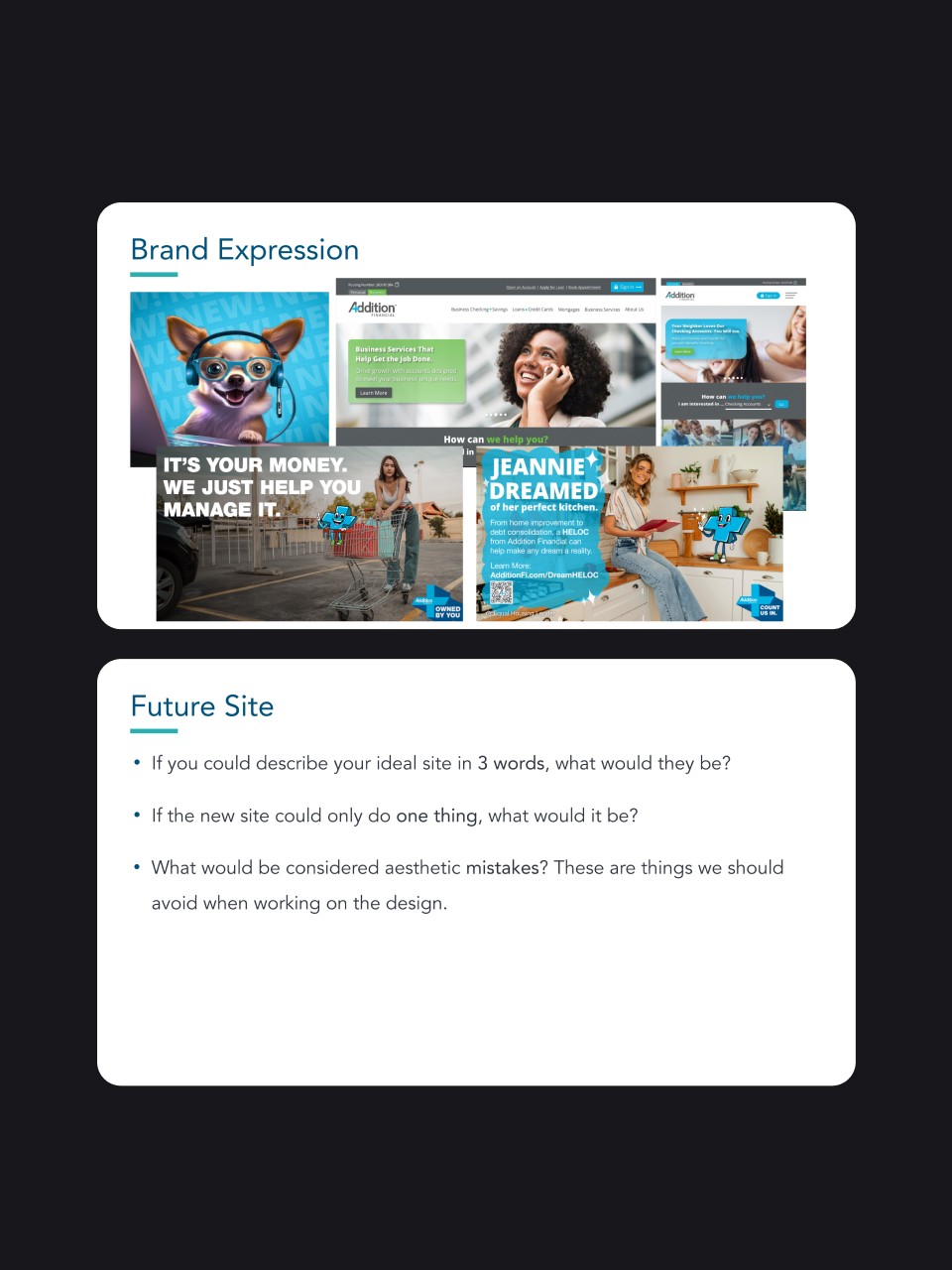
Before diving into design, I conducted a Design Discovery session with stakeholders to establish visual direction, review brand materials, understand their frustrations with the current site, and align on design goals.
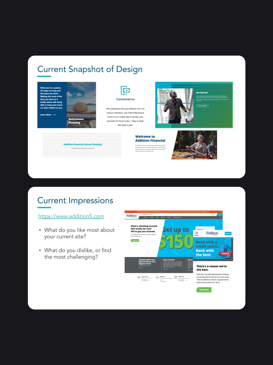

Member Feedback Revealed Critical Issues
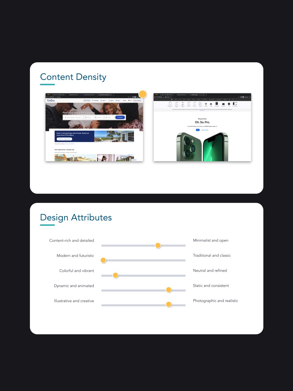
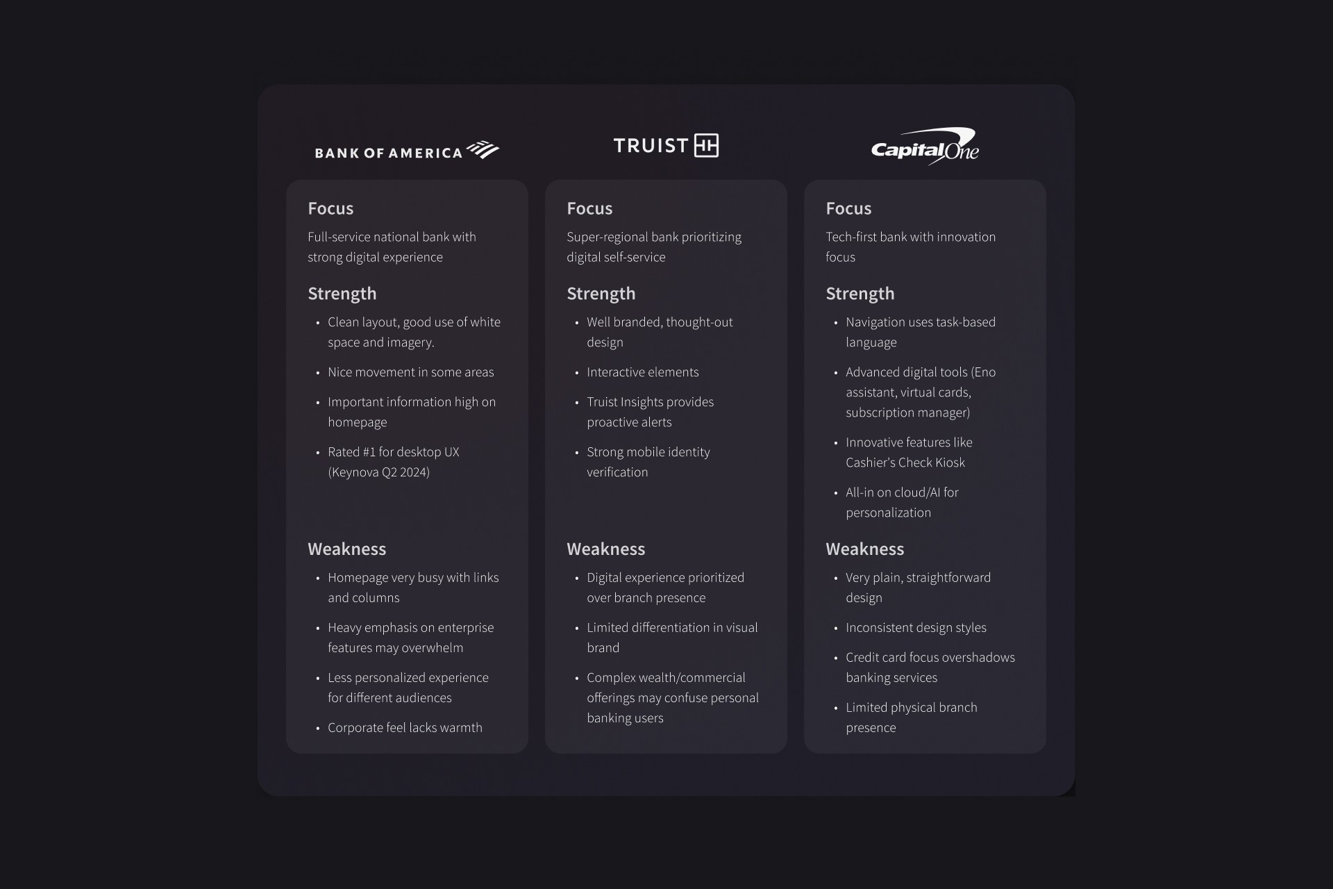
Competitive Analysis
I reviewed traditional banks (Bank of America, Truist, Capital One) and peer credit unions (VyStar, Suncoast, Fortera, Georgia United) to identify industry patterns and differentiation opportunities.
Key Insights
Three discoveries shaped my design direction:
Task-based thinking: Members approached the site with specific goals ("I'd like to open a checking account," "I'd like to apply for a loan") but navigation was organized by organizational structure rather than user tasks
Personalization gap: Personal and Business audiences had fundamentally different needs, yet received identical content and navigation
Action barriers: The site functioned primarily as an information repository when it needed to be a conversion engine—making it easy to learn about services but difficult to actually sign up or take action
Wireframes & Information Architecture
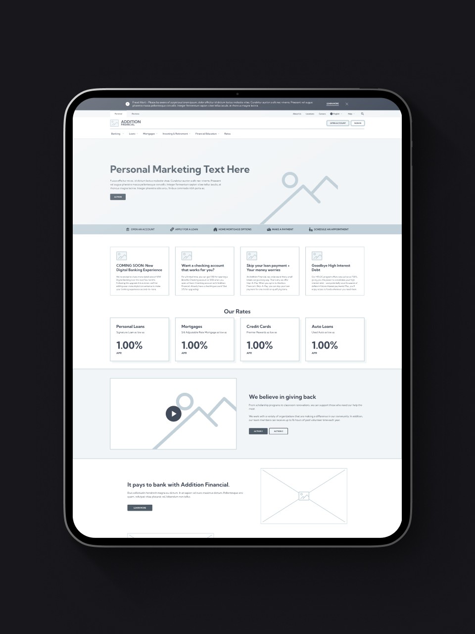
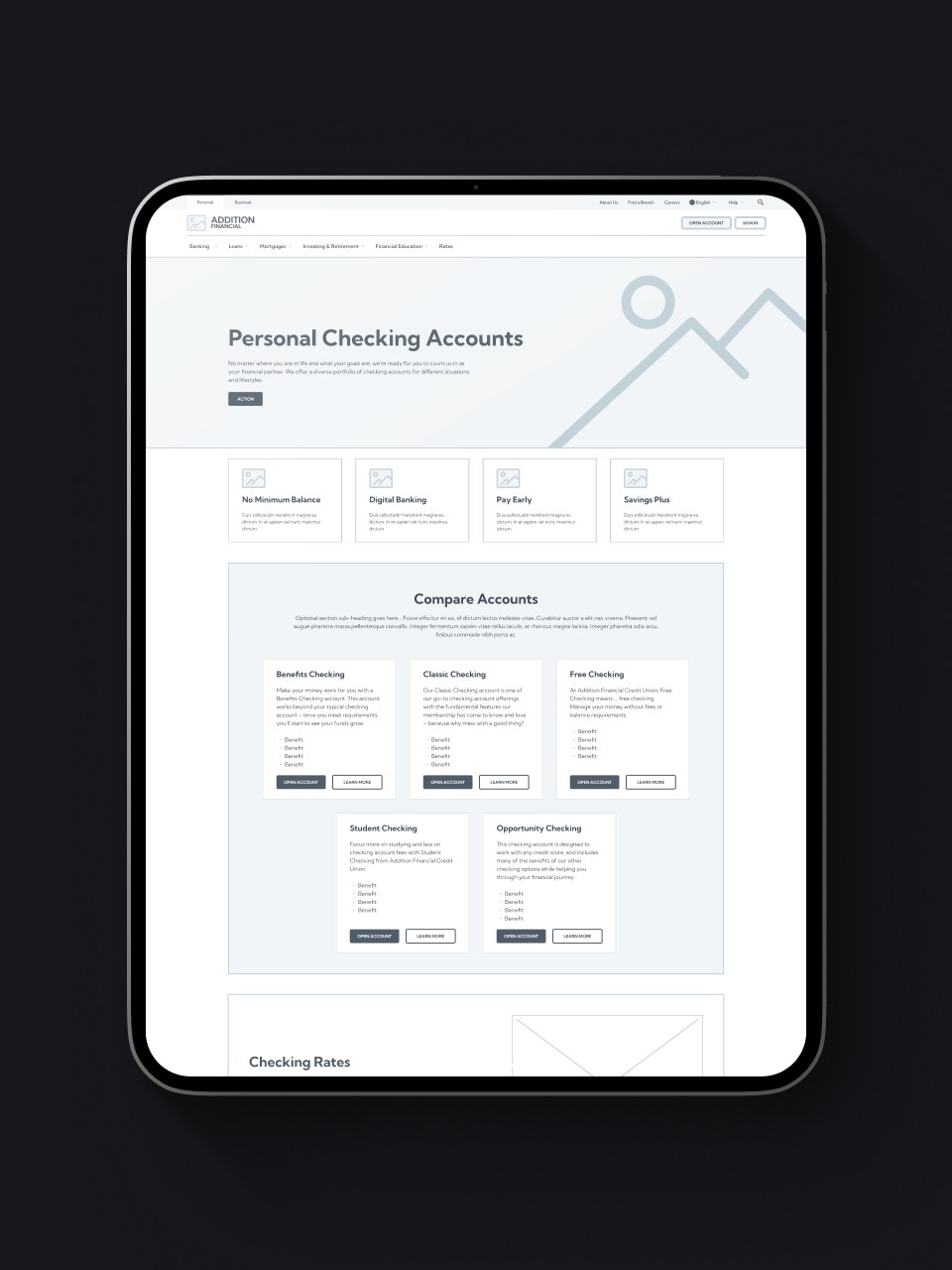
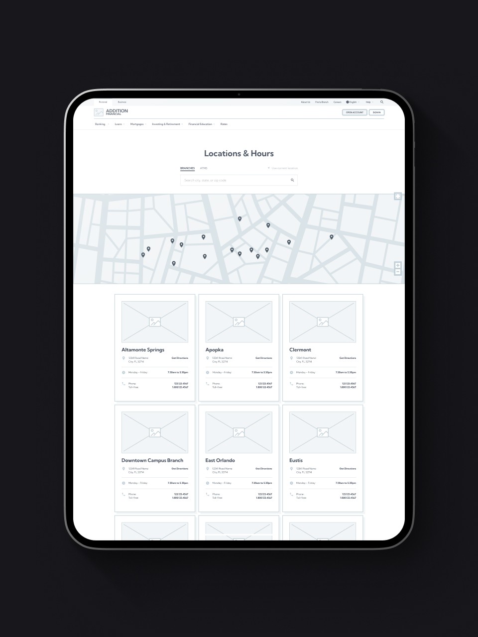
Before jumping into visual design, we restructured the site's information architecture and created comprehensive wireframes to validate navigation improvements and establish content patterns.
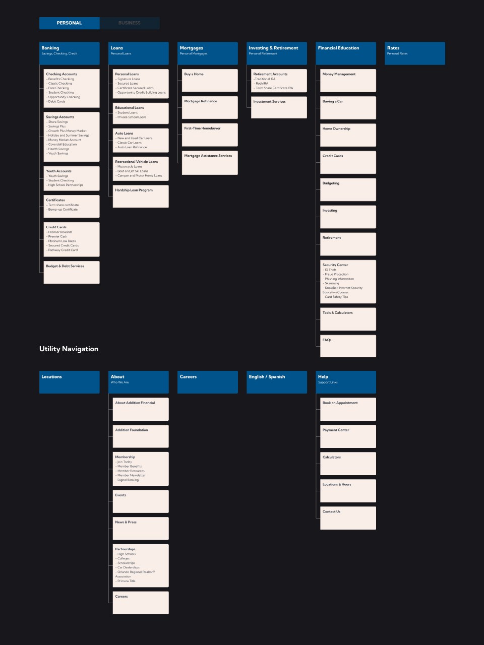
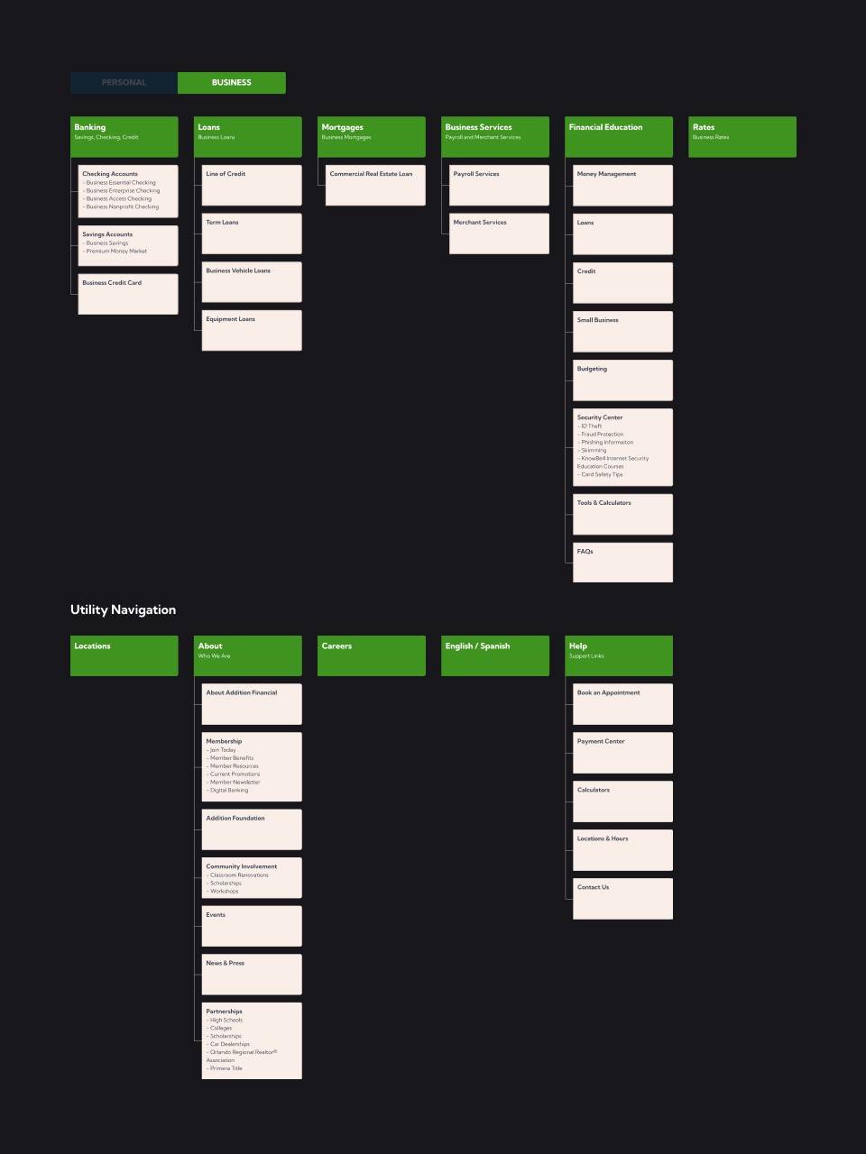
Sitemap Restructure
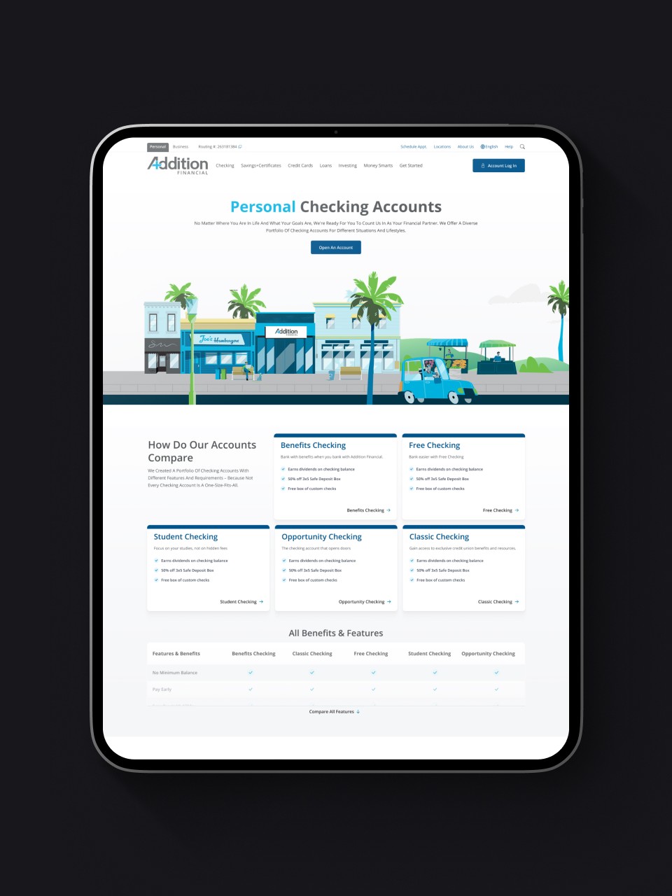
We developed a new sitemap that flattened the navigation hierarchy, eliminating unnecessary intermediate pages. Instead of deep paths like Personal > Savings & Checking > Checking Accounts, users could navigate directly to Banking > Checking Accounts. The Personal/Business audience toggle we recommended in the wireframes removed the need for separate landing pages entirely, allowing both audiences to access relevant top-level services immediately.
Wireframe Validation
I wireframed the complete site structure—global elements (desktop and mobile headers, footers, navigation), page templates (homepage, interior pages, product pages, article pages, event pages, location pages), and individual components (feature lists, banners, blocks, accordions, rates tables, card lists).
These wireframes served three critical functions:
Visualizing IA Improvements: Stakeholders could see exactly how the flattened hierarchy reduced clicks to key content, making the structural changes tangible rather than abstract.
Demonstrating Personalization: I wireframed both Personal and Business versions of the navigation to show how content and links would adapt based on the selected tab—proving how one template system could serve two distinct audiences.
Establishing Content Patterns: By wireframing all major page types and components, I created consistent structural logic across the site—product listings followed the same organizational principles as event listings and location listings, reducing cognitive load and creating predictable user patterns.
The sitemap and wireframes became our alignment tool—ensuring developers, content strategists, and stakeholders understood the structural foundation before investing in visual design and development.
Visualizing the IA Simplification: The wireframes made the flattened navigation hierarchy tangible for stakeholders. Instead of abstract sitemap discussions, they could see how eliminating intermediate pages like "Savings & Checking" would create direct paths to "Checking Accounts" and "Savings Accounts." The before/after comparison in wireframe form demonstrated how many fewer clicks members would need to reach key content.


Design Solutions
Visual Direction
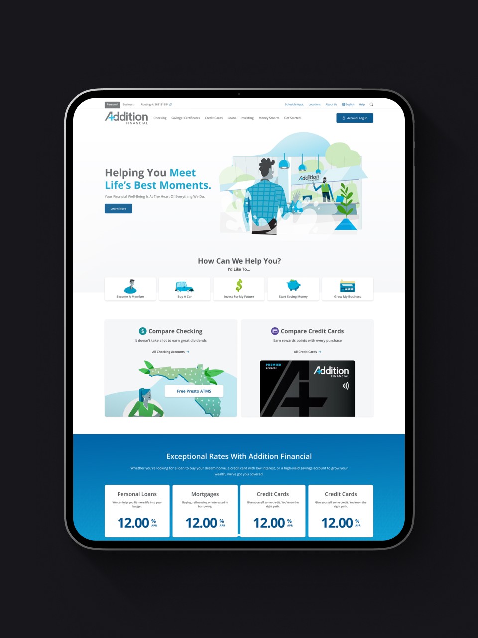
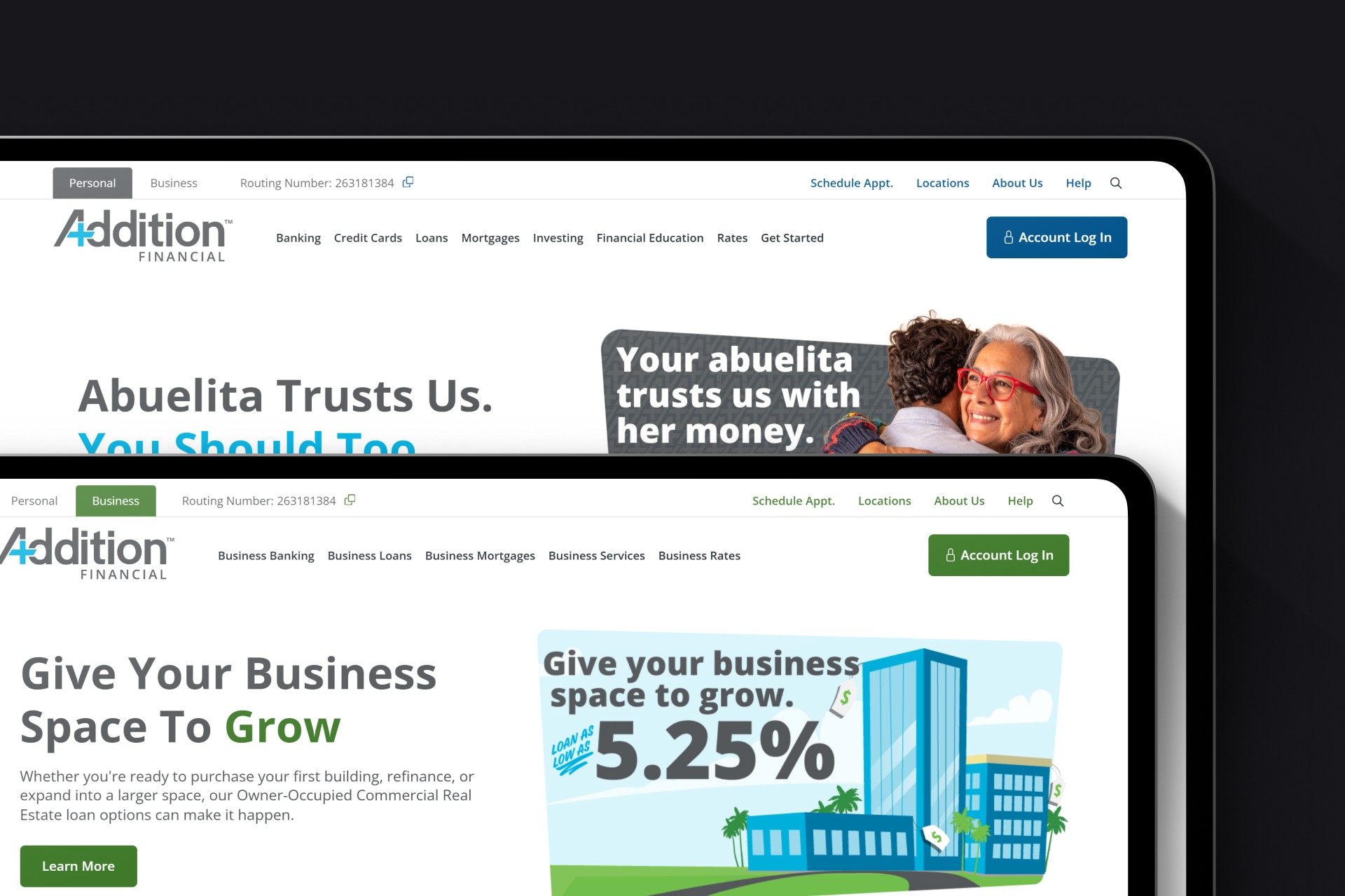
I created the visual design around Addition Financial's brand refresh, incorporating their new mascot, vector illustration style, and vibrant color palette. We presented multiple layout variations—some with real life photography and another using animated character graphics—but ultimately landed on a fully illustrated approach that felt unique, modern, and distinctly on-brand compared to traditional financial institutions using stock photography.
Expand to see the full design.
Before
After
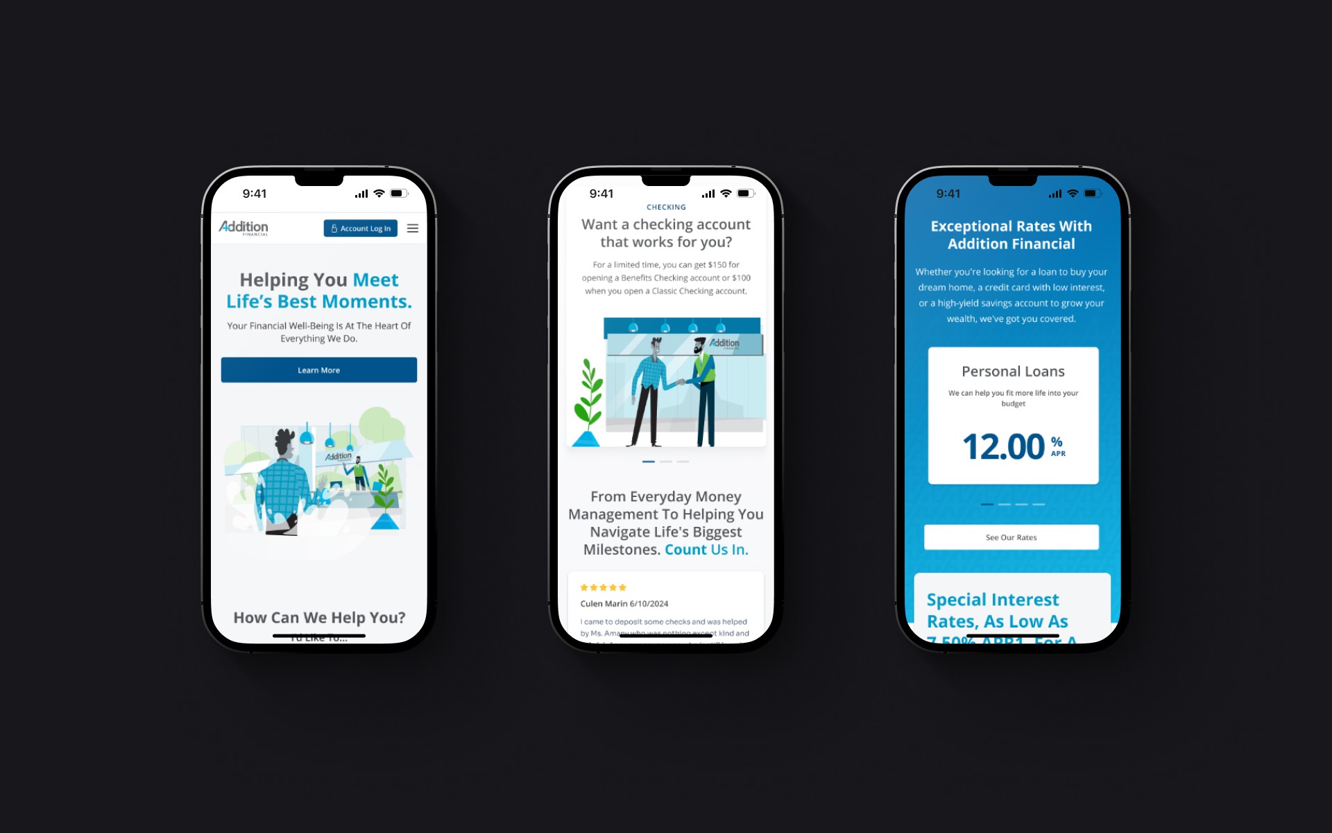
Personalized Audience Experiences
I designed a tabbed navigation system in the header allowing users to toggle between Personal and Business banking experiences. This wasn't just a visual change—the entire site content, navigation links, and accent colors adapted based on selection:
Personal tab: Blue accent colors, personal banking services, relevant CTAs for individual members
Business tab: Green accent colors, business banking services, CTAs focused on business needs
This approach let us serve two distinct audiences without forcing them to filter through irrelevant content.
Responsive Design
Given the old site's 8.9-second mobile load time, I took special care designing how each component would adapt across devices. The mobile menu was redesigned with thumb-friendly tap targets and fluid navigation patterns. Every component was tested for responsive behavior to ensure consistent, fast experiences regardless of device.
Impact & Reflection
The redesigned Addition Financial website launched in 2024, successfully representing their brand refresh and modernized platform. Stakeholder feedback was overwhelmingly positive:
This project deepened my expertise in personalization strategy—learning how to effectively serve multiple audiences with distinct needs through a single platform. I developed stronger skills in handling divergent client feedback, finding middle-ground solutions that satisfied stakeholder preferences while maintaining UX best practices.
If I could revisit this project, I'd push for more unique, differentiated components rather than focusing on 1:1 conversion from the old site's component library. The illustrated design direction was bold—the component system could have been equally innovative.
I'm most proud of the personalization system's elegance—a simple tab toggle that fundamentally transforms the user experience without technical complexity. This approach gave Addition Financial a competitive advantage in serving diverse member needs while maintaining a cohesive brand presence.